Use Storybook with Tailwind in an Nx Workspace

In the previous article, we talked about Nx workspace generators and how they can help be more efficient in automating repetitive tasks. In this article, we’re going to leverage Nx’s excellent support for Storybook to develop our components in isolation before using them in our Next.js app.
Building a blog with Next.js and Nx Series
This article is part of a series around building a blog with Nx, Next.js, Tailwind, Storybook and Cypress.
- Create a Next.js web app with Nx
- Setup Next.js to use Tailwind with Nx
- Read and render Markdown files with Next.js and Nx
- Component hydration with MDX in Next.js and Nx
- Hot Reload MDX changes in Next.js with Nx
- Using Nx Workspace generators to scaffold new blog posts
- Use Storybook with Next.js, Tailwind and Nx to develop components in isolation
- Use Cypress with Next.js and Nx to battle test your React Components
- Publishing a Next.js app to Vercel with Nx
Check back later, follow me on Twitter or subscribe to the Newsletter to get updates about upcoming articles
Generate a new library to host our page UI components
We want to have a library where to host our UI components s.t. they can be easily shared within our Nx workspace. Obviously, in our simple example of a blog platform, right now we don’t really have other apps in our workspace. In many cases a Nx workspace starts like this, and then over time we add new applications, either because new projects start or even because we split up existing projects into multiple ones for a better scalability. Furthermore, having a shared UI library is a common scenario especially in larger real-world applications to encapsulate the corporate design components.
To generate a new library, simply refer to the @nrwl/react:lib generator:
npx nx g @nrwl/react:lib ui --directory=shared --style=cssNotice, by passing the --directory=shared, Nx generates the library into a subfolder libs/shared/ui. Grouping libraries into sub-folders helps to further structure them.
In addition to generating the library setup, the above command also pre-generates a component shared-ui.tsx for us. Since we won’t use that one right now, we can that we can just remove it.
So what do we want to achieve? Currently, on my blog, I have a ”collection page” that contains small tiles for each type of topic I’ve been writing on the site. It looks something like this:
We want to replicate that as a React component. So let’s create a new component named “topic-button”
npx nx g @nrwl/react:component topic-button --project=shared-ui --style=cssBy providing --project we make sure it gets generated into our new shared/ui library. Confirm the question about exporting the component. We definitely want to do that as we plan to use it in our Next app’s page.
Notice also the / is changed to - when providing the project. You can also always look up the workspace.json for the corresponding name of the project. Or use Nx Console and get a nice autocomplete 😀.
Add Storybook Support to our Shared UI Library
Let’s add Storybook support to our library, such that we can develop our components in isolation. Let’s use Nx Console this time. Activate the VSCode command palette and type “Nx: ”
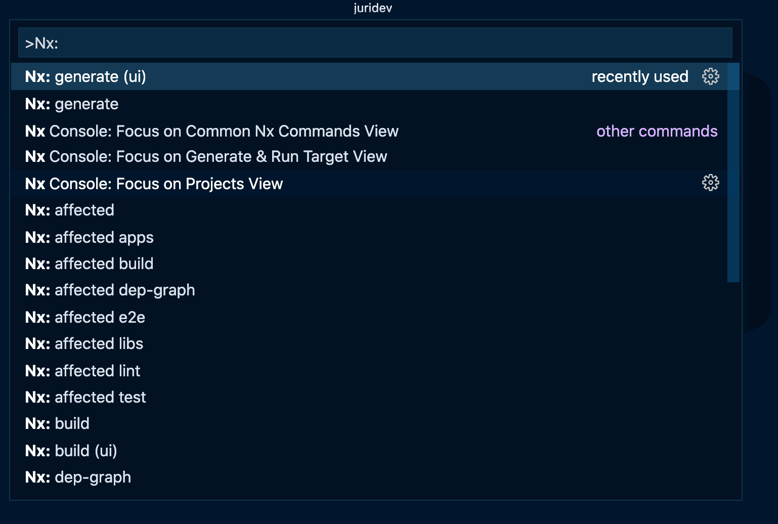
Choose “Nx generate (ui)” and search for “@nrwl/react:storybook-configuration”.
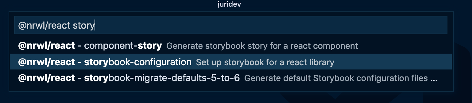
Provide the shared-ui in the project name to make sure the Storybook configuration gets generated for our UI library. In addition, I like to group my storybook related e2e tests into a dedicated folder, which is why I specify storybook-e2e for the cypressDirectory.
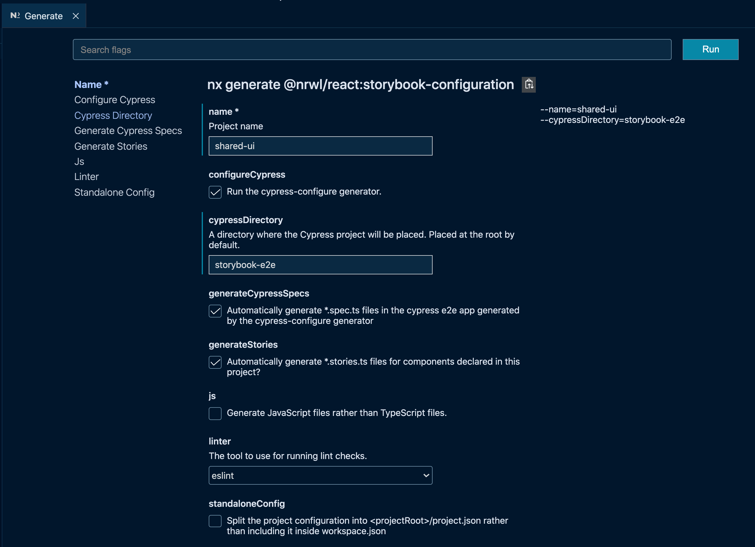
For those of you not using VSCode or simply preferring the CLI, here’s the generate command:
npx nx generate @nrwl/react:storybook-configuration --name=shared-ui --cypressDirectory=storybook-e2eWhat we get is the following:
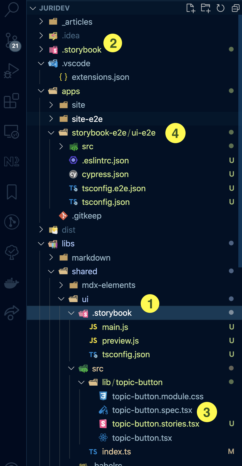
- Storybook configured for our
shared/uilibrary - A workspace-level Storybook configuration. Such configuration is particularly handy if you want to apply some specific configuration to all of your Storybooks within the Nx workspace. The project-level storybook setup simply imports the global Webpack configuration (as well as Storybook Add-ons and more) and applies them to the project-level Storybook configuration.
- A new Storybook story was generated automatically for our
topic-button.tsxcomponent. Note, you can always again trigger this by invoking thestoriesgenerator in the very same fashion as we did for the Storybook configuration setup - A Cypress-based e2e test including test files for our
topic-button.stories.tsx. We’re going to cover this in more detail in the next article of the series. So stay tuned!
Launch Storybook for our shared UI library
npx nx storybook shared-uiThis launches Storybook and you should see the pre-generated Topic Button React component is visualized.
Setup Storybook to use Tailwind
By using the @nrwl/react/plugin/storybook preset in your configuration (which is automatically preconfigured by the Nx Storybook generator), you’re already set up to use Tailwind.
// libs/shared/ui/.storybook/main.js
const rootMain = require('../../../../.storybook/main');

module.exports = {
  ...
  addons: [...rootMain.addons, '@nrwl/react/plugins/storybook'],
  ...
};
We only need to actually create the tailwind.config.js and postcss.config.js within our shared/ui library.
cd libs/shared/ui
npx tailwindcss init -p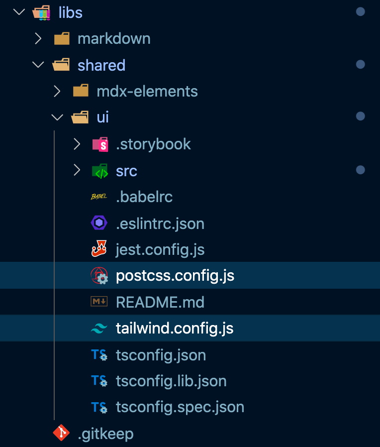
Adjust the tailwind.config.js similarly to what we did for the Next application:
// libs/shared/ui/tailwind.config.js
const { createGlobPatternsForDependencies } = require('@nrwl/next/tailwind');
const { join } = require('path');

module.exports = {
  presets: [require('../../../tailwind-workspace-preset.js')],
  purge: [
    join(__dirname, '../src/**/*.{js,ts,jsx,tsx}'),
    ...createGlobPatternsForDependencies(__dirname),
  ],
  darkMode: false, // or 'media' or 'class'
  theme: {
    extend: {},
  },
  variants: {
    extend: {},
  },
  plugins: [],
};
Again, we’d want to extend from the root-level Tailwind configuration to make sure we get repository-wide settings (e.g. your corporate-wide Tailwind settings).
Similarly we adjust the postcss.config.js
// libs/shared/ui/postcss.config.js
const { join } = require('path');

module.exports = {
  plugins: {
    tailwindcss: {
      config: join(__dirname, 'tailwind.config.js'),
    },
    autoprefixer: {},
  },
};
Finally, in order to leverage the Tailwind styles in all our Storybook stories, let’s create a new tailwind-imports.cssin libs/shared/ui/.storybook
/* libs/shared/ui/.storybook/tailwind-imports.css */
@tailwind base;
@tailwind components;
@tailwind utilities;
Once we have that file, we can import it into our preview.js file
// libs/shared/ui/.storybook/preview.js
import './tailwind-imports.css';
With that, we should be set up!
Creating our Topic Button React Component
Without going too much into the details, here’s what the content of the button would look like.
// libs/shared/ui/src/lib/topic-button/topic-button.tsx
import { useEffect } from 'react';
import { useState } from 'react';
export interface TopicButtonProps {
  topicName: string;
  onClick?: (topicName: string) => void;
}

export function TopicButton(props: TopicButtonProps) {
  const [icon, setIcon] = useState('');

  useEffect(() => {
    const fetchData = async () => {
      const cleanedSvgName = props.topicName
        .replace(/[^a-zA-Z0-9]/g, '')
        .toLocaleLowerCase();
      const topicSvgIcon = await import(`./${cleanedSvgName}.svg`);
      setIcon(topicSvgIcon.default);
    };
    fetchData();
  }, [props.topicName]);

  const onClickHandler = () => {
    if (props.onClick) {
      props.onClick(props.topicName);
    } else {
      console.warn(
        `no click handler defined on topic button with topic ${props.topicName}`
      );
    }
  };

  return (
    <div
      className="bg-white pl-4 rounded-lg shadow flex max-w-md min-w-max hover:shadow-md transition-shadow"
      onClick={onClickHandler}
    >
      <img src={icon} alt="" className="w-12"  />
      <div className="p-5">
        <h2 className="font-bold text-4xl">{props.topicName}</h2>
      </div>
    </div>
  );
}

export default TopicButton;
A quick explanation of what this component does:
- It renders the Topic button mentioned previously
- The SVG icons are placed directly at the same level as the
topic-button.tsxin theshared/ui/src/lib/topic-buttonfolder. - Based on the passed
topicName, a similar SVG is searched and dynamically imported (see theuseEffectlogic. As a result each topic will have its corresponding SVG icon displayed.
You can find the icons here.
Developing our Storybook story
Nx automatically generates a Storybook story for your React components when you create the initial Storybook configuration for the library.
You can also re-run it afterwards:
nx g @nrwl/react:stories shared-uiLet’s use that pre-generated setup and implement our story:
// libs/shared/ui/src/lib/topic-button/topic-button.stories.tsx
import { Story, Meta } from '@storybook/react';
import { useState } from 'react';
import { TopicButton, TopicButtonProps } from './topic-button';

export default {
  component: TopicButton,
  title: 'TopicButton',
  argTypes: {
    onClick: { action: 'onClick executed!' },
  },
} as Meta;

const Template: Story<TopicButtonProps> = (args) => {
  const [clickedTopic, setClickedTopic] = useState<string | null>(null);
  return (
    <div className="bg-gray-100 p-20">
      <TopicButton
        {...args}
        onClick={(topicName) => setClickedTopic(topicName)}
      />
      {clickedTopic && (
        <div>
          Button has been clicked: {clickedTopic}
        </div>
      )}
    </div>
  );
};

export const Primary = Template.bind({});
Primary.args = {
  topicName: 'Next.js',
};
A couple of things to notice here:
- I wrap the
TopicButtoncomponent in a div and set the background color to make shadows etc more evident. Our main site would probably also have some background color, so ideally we would want to reuse that one here. - I setup a React state hook to record when we click the button and render that into our story. That makes it easy to see whether it worked or didn’t. Notice the default export also has an
argTypesproperty, which logs the click output on the Storybook action panel. So you could also use that if you prefer to inspect the action result.
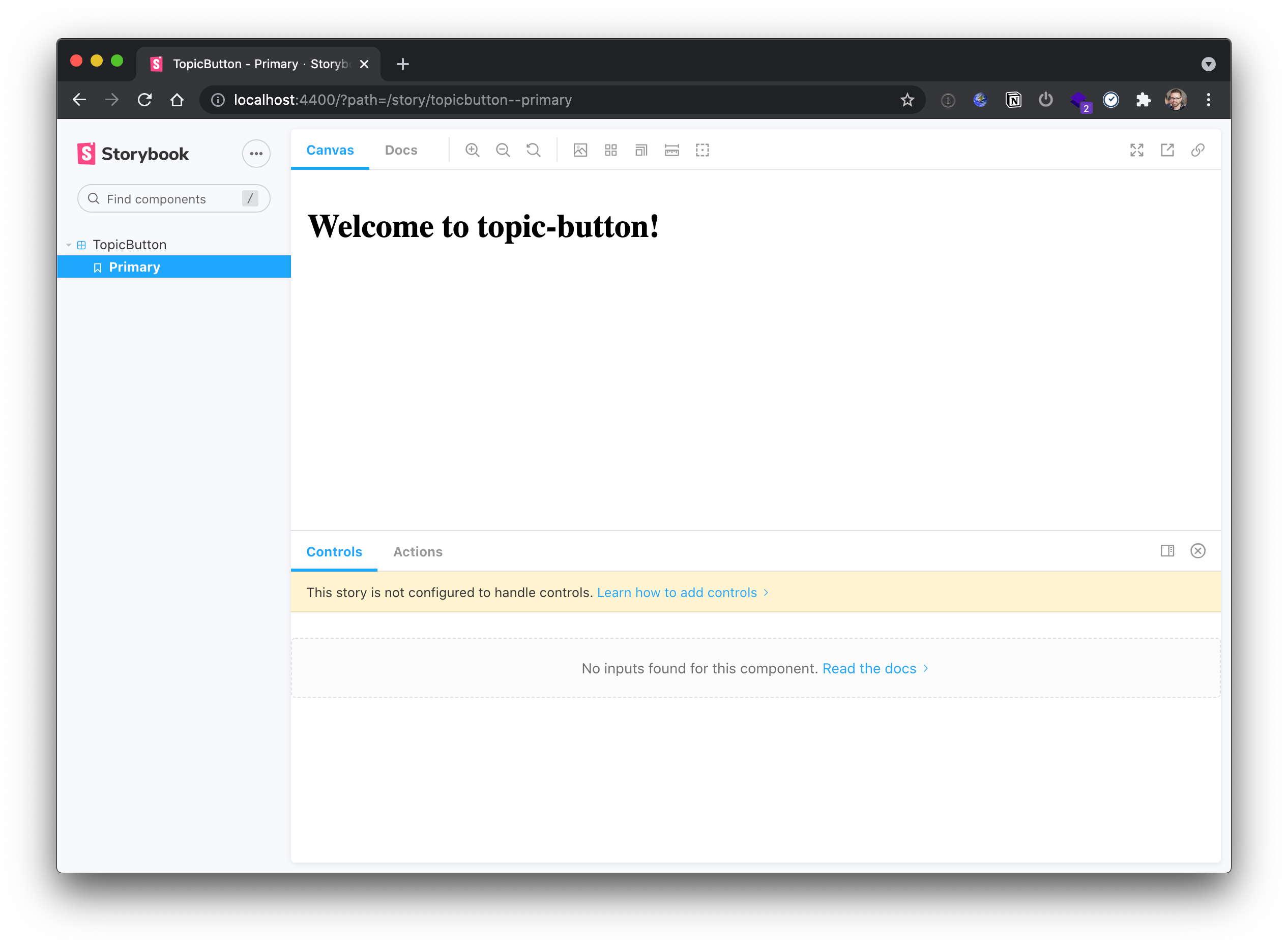
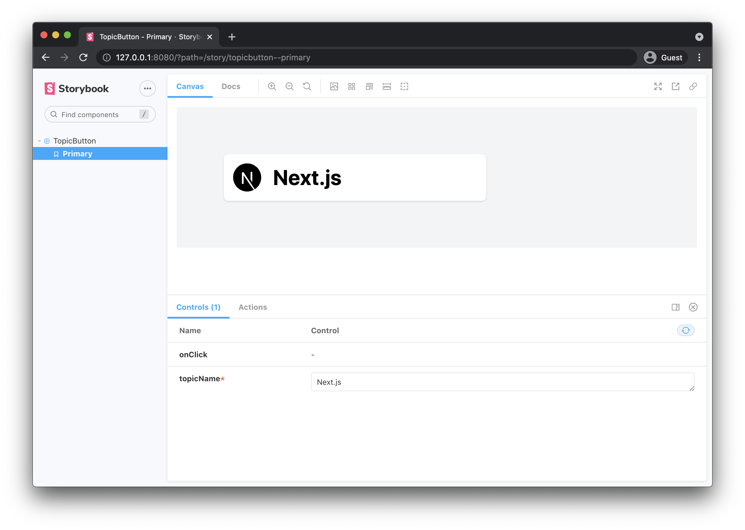
Running Storybook
If you now run the Storybook
npx nx storybook shared-uiwe see our Topic Button rendered properly, using TailwindCSS for the styling part. Changing the topicName in the Storybook controls panel to “React” also changes the icon accordingly
Building Storybook
You can also build and deploy Storybook separately. This is especially interesting for documentation purposes, say when you’re building some shared UI components for your corporate design system.
To build Storybook run
npx nx build-storybook shared-uiThis creates a compiled bundle in dist/storybook/shared-ui which could be directly deployed to some static server. To test it, simply use a local http server and point it to the directory. For example:
npx http-server dist/storybook/shared-uiOpening that in the browser would render Storybook just as it did during development mode:
Using our React Topic Button component in our Next.js app
Storybook is very neat for developing and documenting your components in isolation. But ultimately we want to use the component in our Next powered blog platform application.
Without building the full topic list page, let’s generate a “Topics page” in our Next app and use the newly TopicButton there.
First, we generate a new Next page:
npx nx generate @nrwl/next:page --name=topics --project=siteNext, let’s implement the page component:
// apps/site/pages/topics.tsx
import './topics.module.css';
import { TopicButton } from '@juridev/shared/ui';

/* eslint-disable-next-line */
export interface TopicsProps {}

export function Topics(props: TopicsProps) {
  return (
    <div className="md:container md:mx-auto p-20 bg-gray-100">
      <TopicButton topicName="Next.js" />
    </div>
  );
}

export default Topics;
Notice how we import the TopicButton.
// apps/site/pages/topics.tsx
...
import { TopicButton } from '@juridev/shared/ui';

export function Topics(props: TopicsProps) {
  return (
    ...
      <TopicButton topicName="Next.js" />
    ...
  );
}

export default Topics;
Since Nx automatically maps libraries to paths in tsconfig.base.json, we can just import it from the local libs folder as if it was an npm package.
Finally launching the app properly renders the button on our Next app’s page:
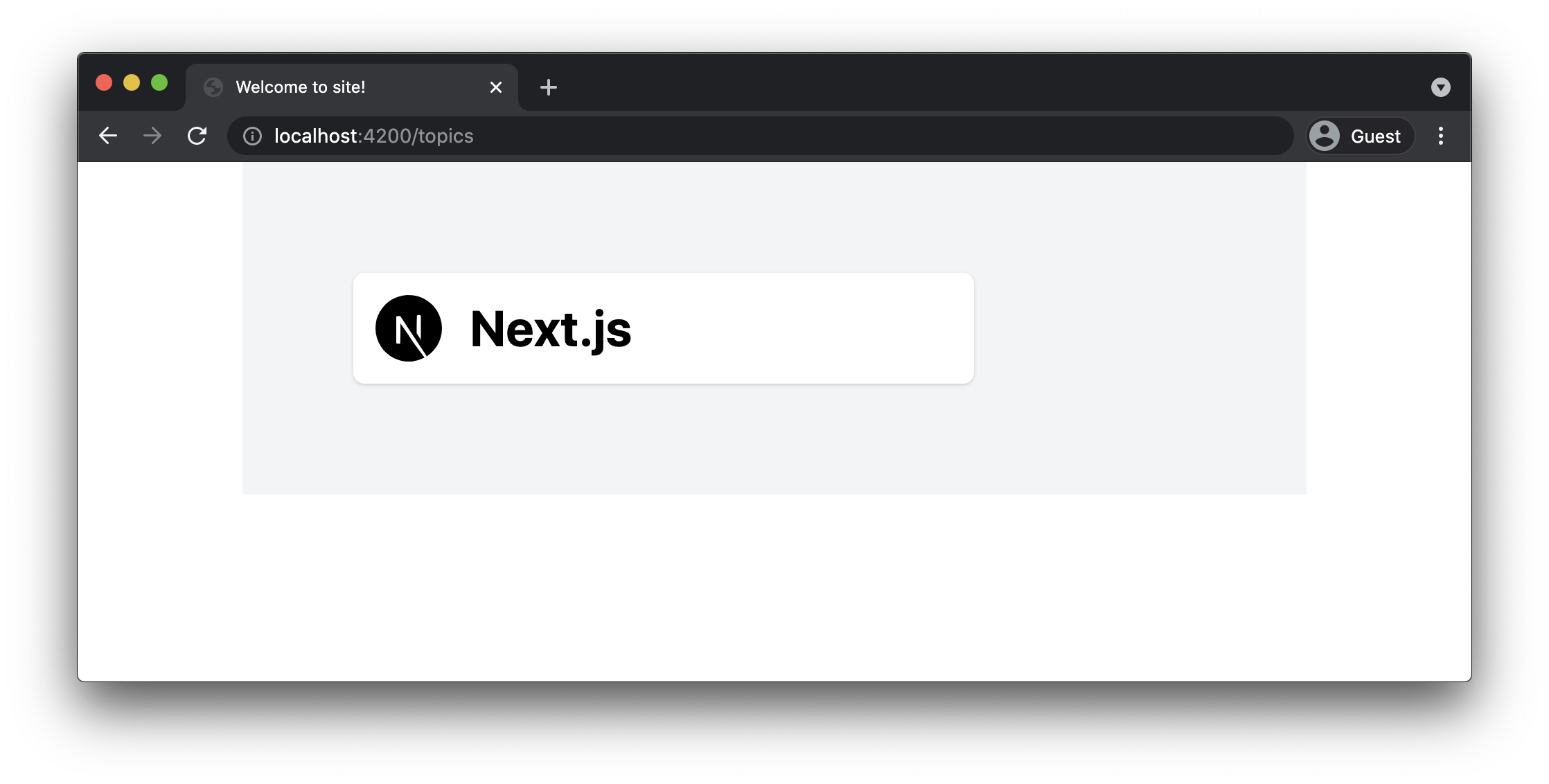
Note, you want to make sure to have svgr support enabled in your next.config.js in order to render SVGs properly.
// apps/site/next.config.js

// eslint-disable-next-line @typescript-eslint/no-var-requires
const withNx = require('@nrwl/next/plugins/with-nx');

module.exports = withNx({
  nx: {
    // Set this to false if you do not want to use SVGR
    // See: https://github.com/gregberge/svgr
    svgr: true,
  }
});
Conclusion
In this article we learned
- How to generate a new React library within our Nx workspace to host the shared UI components
- How to add Storybook support to the React library
- How to configure Storybook to support TailwindCSS
- How to develop a React component in isolation with Storybook
- How to use our shared React component in our Next.js application
GitHub repository
All the sources for this article can be found in this GitHub repository’s branch: https://github.com/juristr/blog-series-nextjs-nx/tree/07-storybook-tailwind